Oxbuild
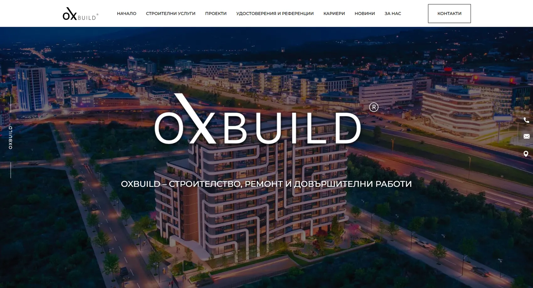
Oxbuild is a construction company with high standards of quality and execution, for which we designed and developed a flagship website.
Oxbuild
Oxbuild is a construction company with high standards of quality and workmanship, for which we designed and developed a representative website. Every construction service is presented in detail and backed by photos of completed projects, to convince potential clients of the company's real competence, not just its promises. We developed several design versions to ensure maximum usability and functionality. The result is a website that reflects the attention to quality the company brings to every construction site.
- Custom design
- UX/UI
- Web design
- Web development
- Back-end development
- Optimization
- Front-end development
- Interactive map
- Hosting & maintenance
- Construction & investment
Branding
The mark is entirely typographic — with the same interlocking pair of “o” and “X” that the sister brand carries. The palette stays black and white, because in construction, color comes from the materials on site, not from the logo.

Logo 1
Colors
White
HEX #FFFFFF
RGB 255,255,255
Silver
HEX #A2A2A2
RGB 162,162,162
Graphite
HEX #222222
RGB 34,34,34
Ink
HEX #00070F
RGB 0,7,15
Typography:
Montserrat
Aa, Bb, Cc, Dd, Ee, Ff, Gg, Hh, Ii, Jj, Kk, Ll, Mm, Nn, Oo, Pp, Qq, Rr, Ss, Tt, Uu, Vv, Ww, Xx, Yy, Zz
0 1 2 3 4 5 6 7 8 9 10

Design for every
device
We design for each screen size separately — from a widescreen monitor to the phone in your pocket — so the experience is equally good everywhere.
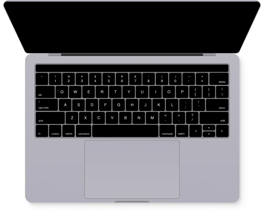
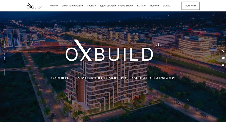
Over 22 pages
A clear structure and well-organized content in which visitors find what they're looking for on the first try.
Design for desktop and mobile
One design that looks and works equally well on a monitor, tablet and phone.
Easy to use
Intuitive navigation and fast loading — nothing standing between the customer and the action.
Every view is tested on real devices before launch — because mobile traffic has long been the main traffic, not the extra.
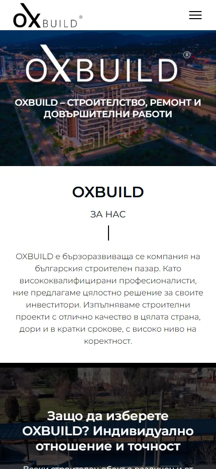
Built with the mobile screen in mind
Over 70% of visits come from a phone. That's why we start there — and build up to tablet and desktop, instead of shrinking a finished desktop design.
Every screen is checked on a real device, not just in a browser. That way, differences are caught before launch, not after it.
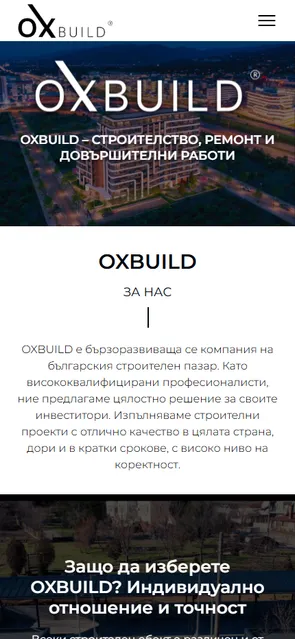
This is the project's real mobile version, exactly as the client sees it.
Phone first, then everything else
We design from the smallest screen up. That way, what matters most stays visible everywhere, instead of being hastily rearranged for mobile.
Fast, even on a weak connection
We optimize images and code for mobile networks. The page starts loading in under a second — not after the visitor has already given up.
Thumb-friendly
Buttons, forms and navigation are designed for one-handed use on the go — no zooming, no accidental taps.
Project timeline
The work proceeds in clear phases with a fixed scope — you know what happens in each one and when to expect the result.
Phase 1 1 week
ResearchStructureCompetitor analysisPhase 2 2 weeks
Custom designUX/UIWeb designPhase 3 2 weeks
Web developmentBack-end developmentFront-end developmentInteractive mapPhase 4 1 week
OptimizationHosting & maintenanceMore projects
All projects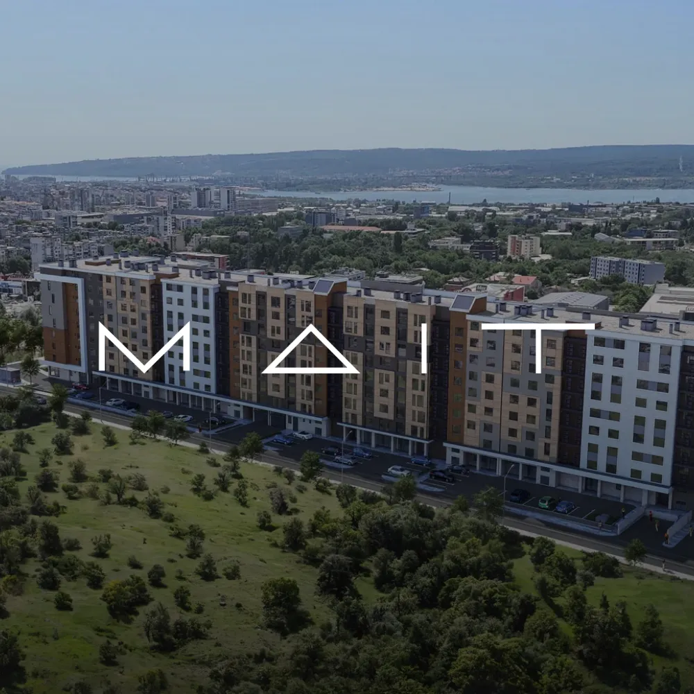
Mait
We designed and developed the flagship website of MAIT — an investment company with over 24 years of experience building modern, low-energy buildings in Bulgaria.
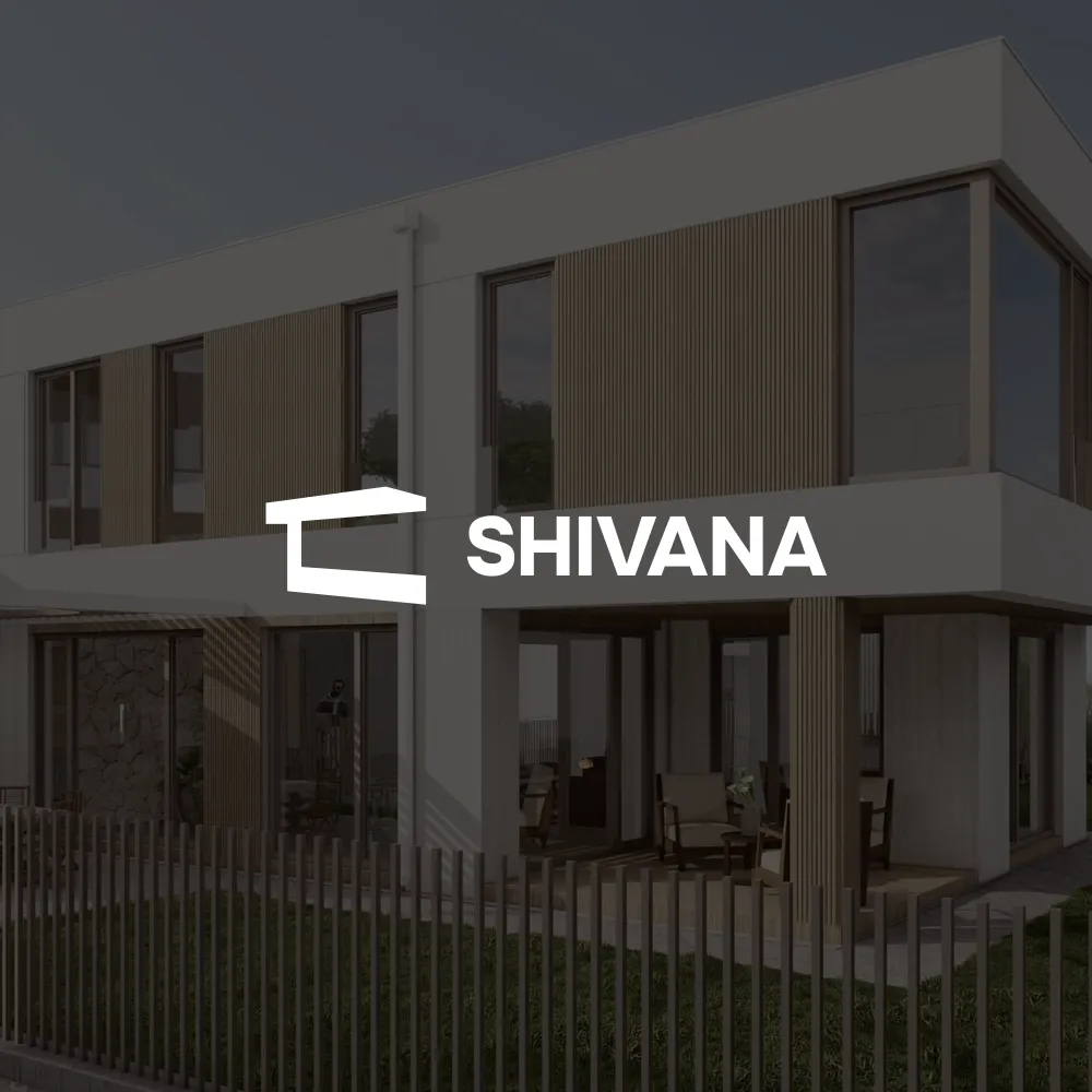
Shivana Residence
We created the website of Shivana Residence — a boutique complex of 21 detached houses with yards and a shared pool in the Priboy area of Asparuhovo, above the Black Sea.