Ortomediks
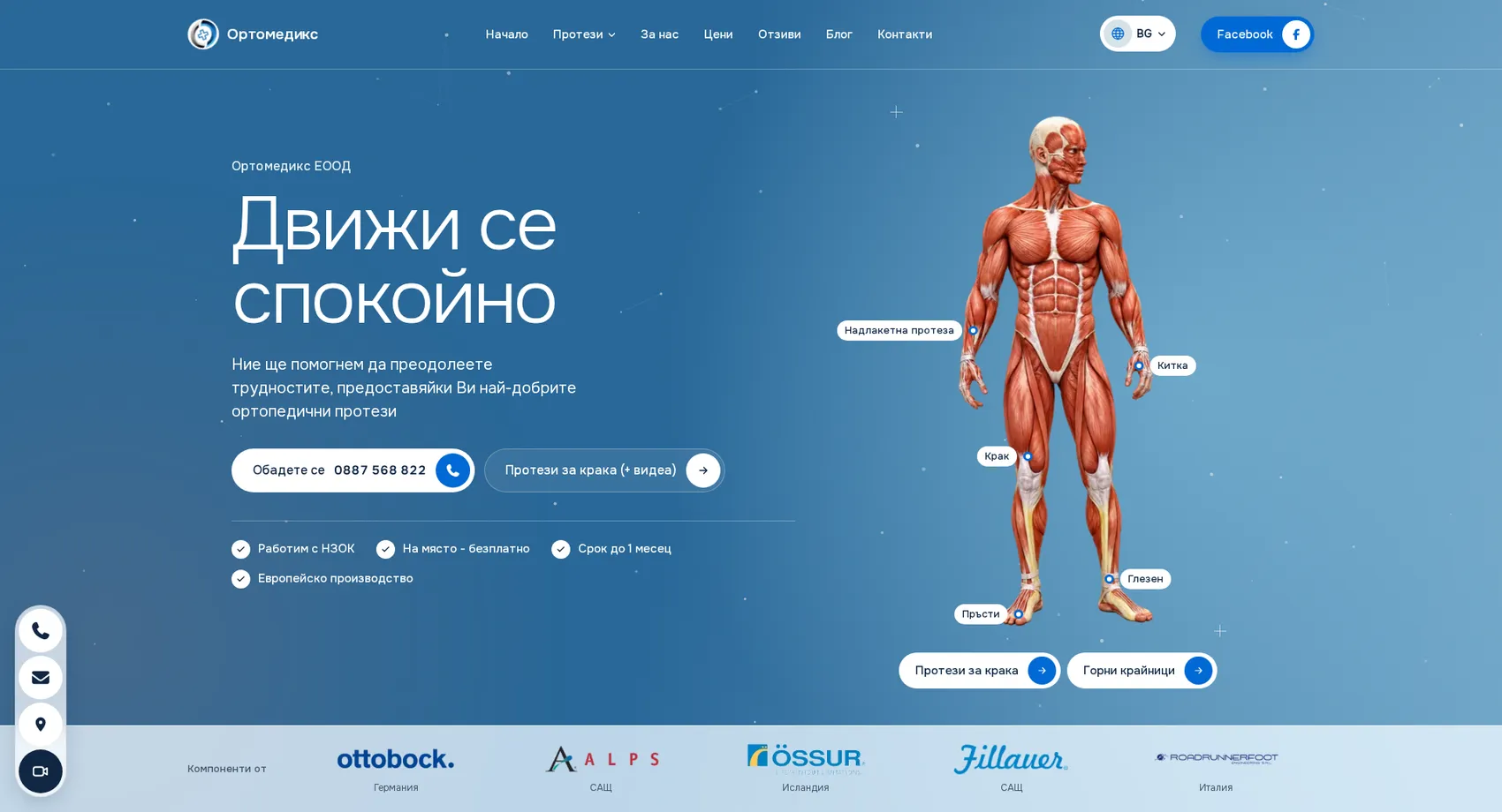
We built the new website of Ortomediks, a prosthetics lab in Varna that works with the Bulgarian National Health Insurance Fund (NHIF) and takes measurements for free at the patient's home.
Ortomediks
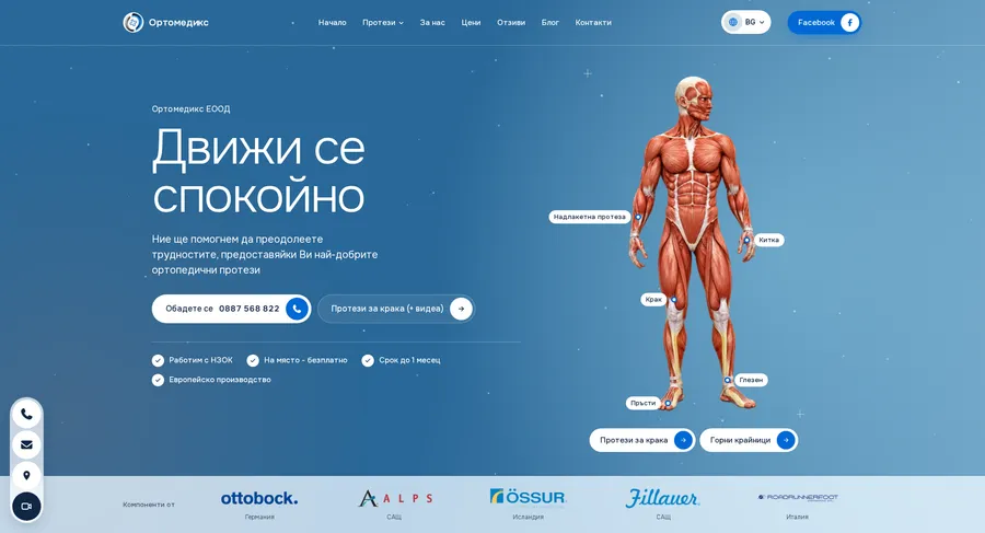
We built the new website of Ortomediks, a prosthetics lab in Varna that works with the Bulgarian National Health Insurance Fund (NHIF). The first screen features an interactive figure of the human body: the patient points to an arm, wrist, leg, ankle or fingers and goes straight to the prostheses for that body part. The lab's four promises (work with the NHIF, free on-site measurement, delivery within one month and European manufacturing) are visible immediately, while components from Ottobock, Össur and Fillauer show what the lab works with. The categories for lower and upper limbs, myoelectric prostheses, electronic knees and sports prostheses each have their own pages. Videos with useful information, patient reviews and the “I'd like you to contact me” form make the first step easier for people going through a difficult time.
- Custom design
- UX/UI
- Web design
- Web development
- Front-end development
- Back-end development
- Optimization
- SEO optimization
- Healthcare & wellness
Branding
The mark stays the same: a ring split into vivid blue and a metallic sheen, with a medical cross in the center. The new website places it in a deeper blue palette. Rich blue is for buttons, dark midnight blue is for headings and dark sections, and amber is only for small accents.
Colors
White
HEX #FFFFFF
RGB 255,255,255
Misty blue
HEX #D6E2E7
RGB 214,226,231
Blue
HEX #0069D5
RGB 0,105,213
Amber
HEX #F5AF20
RGB 245,175,32
Midnight blue
HEX #102743
RGB 16,39,67
Typography:
Onest
Aa, Bb, Cc, Dd, Ee, Ff, Gg, Hh, Ii, Jj, Kk, Ll, Mm, Nn, Oo, Pp, Qq, Rr, Ss, Tt, Uu, Vv, Ww, Xx, Yy, Zz
0 1 2 3 4 5 6 7 8 9 10

Design for every
device
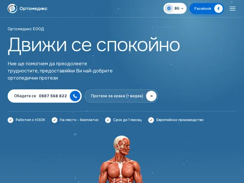
We design for each screen size separately — from a widescreen monitor to the phone in your pocket — so the experience is equally good everywhere.
Over 22 pages
A clear structure and well-organized content in which visitors find what they're looking for on the first try.
Design for desktop and mobile
One design that looks and works equally well on a monitor, tablet and phone.
Easy to use
Intuitive navigation and fast loading — nothing standing between the customer and the action.
Every view is tested on real devices before launch — because mobile traffic has long been the main traffic, not the extra.
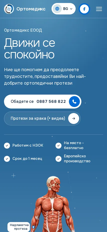
Built with the mobile screen in mind
Over 70% of visits come from a phone. That's why we start there — and build up to tablet and desktop, instead of shrinking a finished desktop design.
Every screen is checked on a real device, not just in a browser. That way, differences are caught before launch, not after it.

Scroll the screen in the phone — this is the project's real mobile version, exactly as the client sees it.
Phone first, then everything else
We design from the smallest screen up. That way, what matters most stays visible everywhere, instead of being hastily rearranged for mobile.
Fast, even on a weak connection
We optimize images and code for mobile networks. The page starts loading in under a second — not after the visitor has already given up.
Thumb-friendly
Buttons, forms and navigation are designed for one-handed use on the go — no zooming, no accidental taps.
Project timeline
The work proceeds in clear phases with a fixed scope — you know what happens in each one and when to expect the result.
Phase 1 1 week
ResearchStructureCompetitor analysisPhase 2 2 weeks
Custom designUX/UIWeb designPhase 3 2 weeks
Web developmentFront-end developmentBack-end developmentPhase 4 1 week
OptimizationMore projects
All projects
Royal Plastic Clinic
We created the website of Royal Plastic Clinic and Dr. Stefan Komitski, MD, PhD — a clinic for plastic, reconstructive and aesthetic surgery in Sofia with a summer practice in Sozopol.
Best Kids Therapy
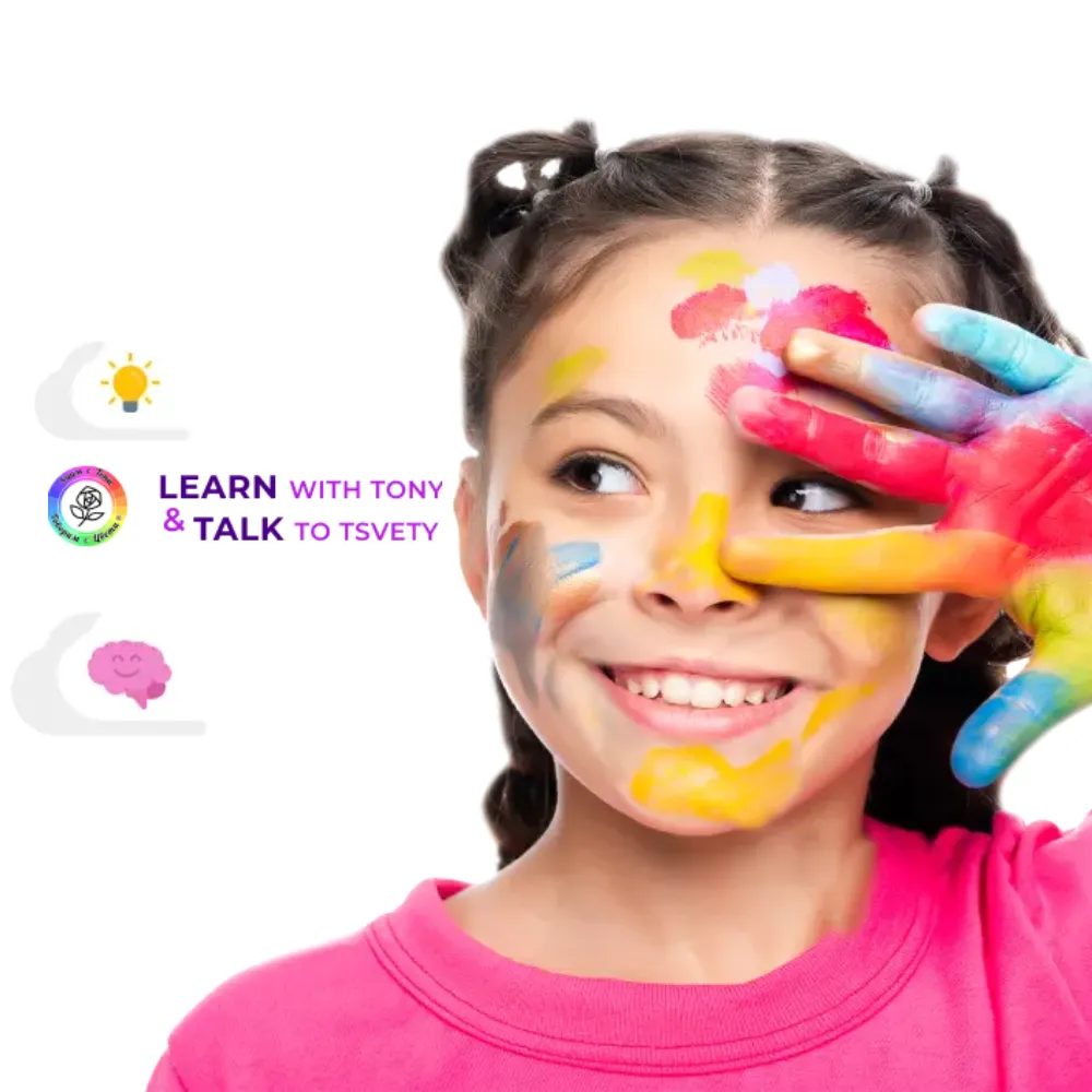
We built a warm and inspiring website for Best Kids Therapy — an innovative center for children's therapy through drawing, nutrition and movement.