OrolineGold
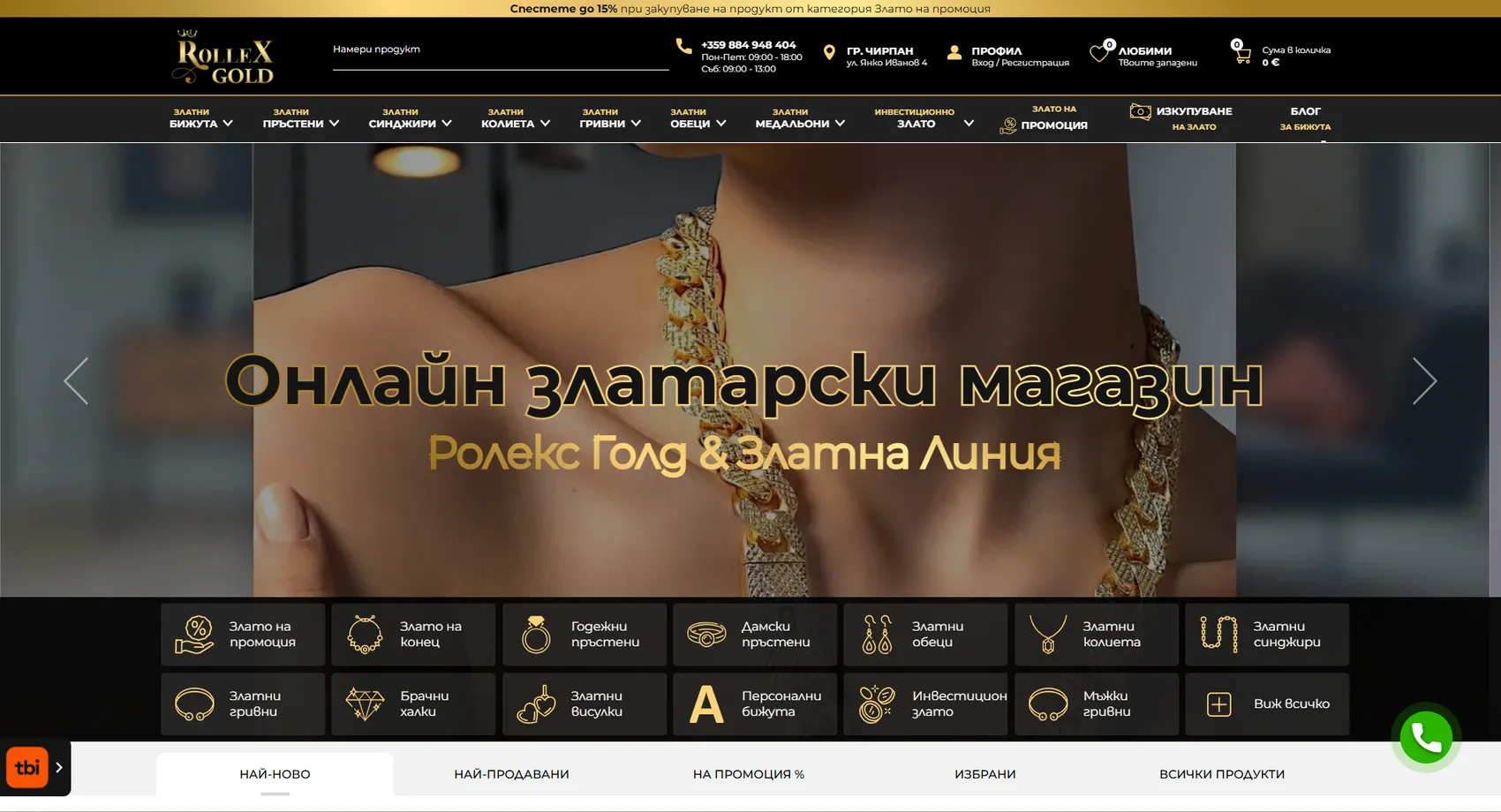
We developed the large-scale OrolineGold platform (also known as Rolex Gold and Zlatna Linia) — an online store for gold jewelry with a tradition dating back to 2004, offering over 10,000 designs.
OrolineGold
We developed OrolineGold (also known as Rolex Gold and Zlatna Linia), a large-scale platform — an online store for gold jewelry with a tradition dating back to 2004, offering over 10,000 designs, 5,000 of which are made to the company’s own designs in its workshop. The owner is a second-generation goldsmith and a certified gold dealer, and the jewelry is sold both online and in store in Chirpan — a combination that requires the store to keep stock synchronized across both channels. We met dozens of specific client requirements related to displaying the fineness, weight and characteristics of each piece, so that buyers get all the information they need to make an investment decision. The result is one of the most complete and technically polished jewelry stores in Europe.
- Custom design
- UX/UI
- Web design
- Web development
- Back-end development
- Optimization
- Front-end development
- Hosting & maintenance
- Fashion store
Branding
Gold is both the product and the palette. The mark rests on a classic serif with a crown above the name, and the shimmering metallic fill is repeated in buttons and frames throughout the store — so the storefront looks like the merchandise itself.

Colors
White
HEX #FFFFFF
RGB 255,255,255
Light gold
HEX #FBD478
RGB 251,212,120
Gold
HEX #B1882C
RGB 177,136,44
Ink
HEX #141414
RGB 20,20,20
Typography:
Montserrat
Aa, Bb, Cc, Dd, Ee, Ff, Gg, Hh, Ii, Jj, Kk, Ll, Mm, Nn, Oo, Pp, Qq, Rr, Ss, Tt, Uu, Vv, Ww, Xx, Yy, Zz
0 1 2 3 4 5 6 7 8 9 10

Design for every
device
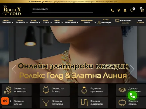
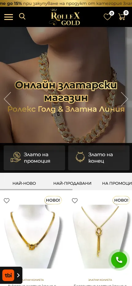
We design for each screen size separately — from a widescreen monitor to the phone in your pocket — so the experience is equally good everywhere.
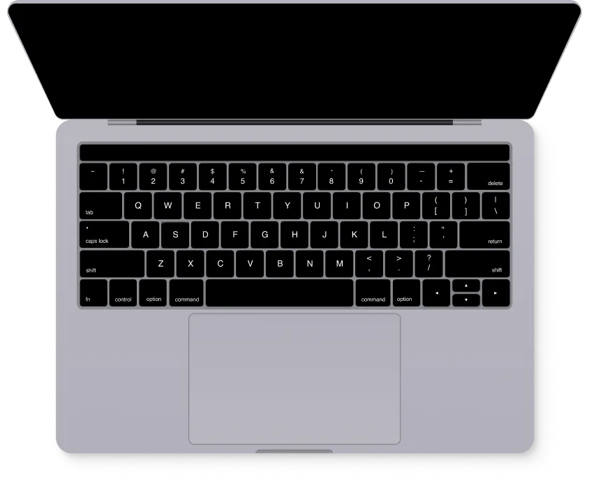
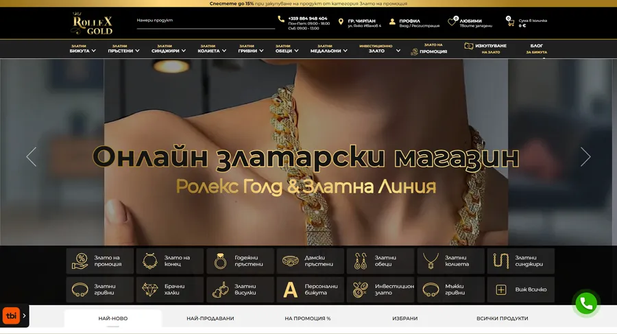
Over 22 pages
A clear structure and well-organized content in which visitors find what they're looking for on the first try.
Design for desktop and mobile
One design that looks and works equally well on a monitor, tablet and phone.
Easy to use
Intuitive navigation and fast loading — nothing standing between the customer and the action.
Every view is tested on real devices before launch — because mobile traffic has long been the main traffic, not the extra.
Built with the mobile screen in mind
Over 70% of visits come from a phone. That's why we start there — and build up to tablet and desktop, instead of shrinking a finished desktop design.
Every screen is checked on a real device, not just in a browser. That way, differences are caught before launch, not after it.

Scroll the screen in the phone — this is the project's real mobile version, exactly as the client sees it.
Phone first, then everything else
We design from the smallest screen up. That way, what matters most stays visible everywhere, instead of being hastily rearranged for mobile.
Fast, even on a weak connection
We optimize images and code for mobile networks. The page starts loading in under a second — not after the visitor has already given up.
Thumb-friendly
Buttons, forms and navigation are designed for one-handed use on the go — no zooming, no accidental taps.
Project timeline
The work proceeds in clear phases with a fixed scope — you know what happens in each one and when to expect the result.
Phase 1 1 week
ResearchStructureCompetitor analysisPhase 2 2 weeks
Custom designUX/UIWeb designPhase 3 2 weeks
Web developmentBack-end developmentFront-end developmentPhase 4 1 week
OptimizationHosting & maintenance