Olleo
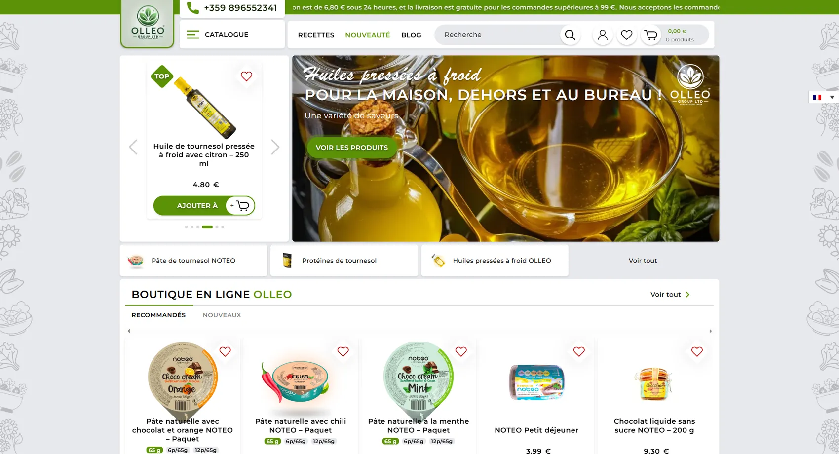
We developed the multilingual online store Olleo.be — a Belgian brand of cold-pressed oils for home, outdoors and the office, reaching customers in Belgium, France and Germany.
Olleo
We developed the multilingual online store Olleo.be — a Belgian brand of cold-pressed oils for the home, the outdoors and the office, reaching customers in Belgium, France and Germany. Special emphasis in the product portfolio is placed on Bulgarian products, which makes the store stand out on the Belgian market. The platform combines a clean design with easy navigation between categories and includes a blog section, multiple payment options and a subscription system for regular customers who reorder their oils periodically. The admin panel is optimized for fast product and order management, and the entire site is built Mobile First with built-in SEO optimization to reach new buyers organically in all three markets.
- Custom design
- UX/UI
- Web design
- Web development
- Back-end development
- Optimization
- Front-end development
- Hosting & maintenance
- Online stores
Branding
The mark is a round seal with leaves — the seed and the plant the oil comes from — with the name and “healthy food trade” set in small type beneath it. The green comes in two shades: saturated for buttons and labels, muted for backgrounds, while white keeps the catalog clean and readable in three languages.

Colors
White
HEX #FFFFFF
RGB 255,255,255
Mint
HEX #D7DED5
RGB 215,222,213
Green
HEX #5C9208
RGB 92,146,8
Dark green
HEX #366039
RGB 54,96,57
Typography:
Montserrat
Aa, Bb, Cc, Dd, Ee, Ff, Gg, Hh, Ii, Jj, Kk, Ll, Mm, Nn, Oo, Pp, Qq, Rr, Ss, Tt, Uu, Vv, Ww, Xx, Yy, Zz
0 1 2 3 4 5 6 7 8 9 10
Open Sans
Aa, Bb, Cc, Dd, Ee, Ff, Gg, Hh, Ii, Jj, Kk, Ll, Mm, Nn, Oo, Pp, Qq, Rr, Ss, Tt, Uu, Vv, Ww, Xx, Yy, Zz
0 1 2 3 4 5 6 7 8 9 10

Design for every
device
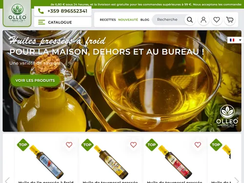
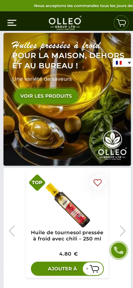
We design for each screen size separately — from a widescreen monitor to the phone in your pocket — so the experience is equally good everywhere.
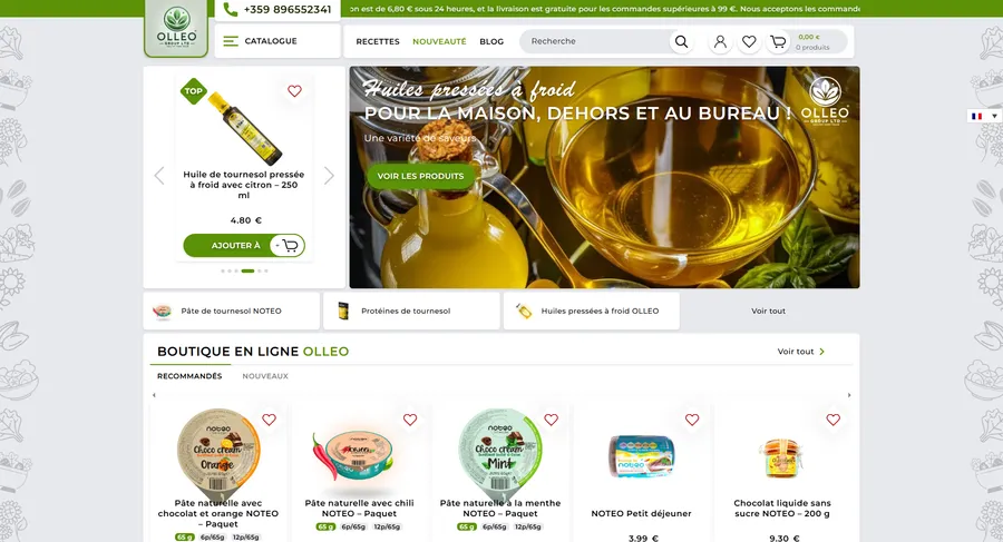
Over 22 pages
A clear structure and well-organized content in which visitors find what they're looking for on the first try.
Design for desktop and mobile
One design that looks and works equally well on a monitor, tablet and phone.
Easy to use
Intuitive navigation and fast loading — nothing standing between the customer and the action.
Every view is tested on real devices before launch — because mobile traffic has long been the main traffic, not the extra.
Built with the mobile screen in mind
Over 70% of visits come from a phone. That's why we start there — and build up to tablet and desktop, instead of shrinking a finished desktop design.
Every screen is checked on a real device, not just in a browser. That way, differences are caught before launch, not after it.

Scroll the screen in the phone — this is the project's real mobile version, exactly as the client sees it.
Phone first, then everything else
We design from the smallest screen up. That way, what matters most stays visible everywhere, instead of being hastily rearranged for mobile.
Fast, even on a weak connection
We optimize images and code for mobile networks. The page starts loading in under a second — not after the visitor has already given up.
Thumb-friendly
Buttons, forms and navigation are designed for one-handed use on the go — no zooming, no accidental taps.
Project timeline
The work proceeds in clear phases with a fixed scope — you know what happens in each one and when to expect the result.
Phase 1 1 week
ResearchStructureCompetitor analysisPhase 2 2 weeks
Custom designUX/UIWeb designPhase 3 2 weeks
Web developmentBack-end developmentFront-end developmentPhase 4 1 week
OptimizationHosting & maintenanceMore projects
All projects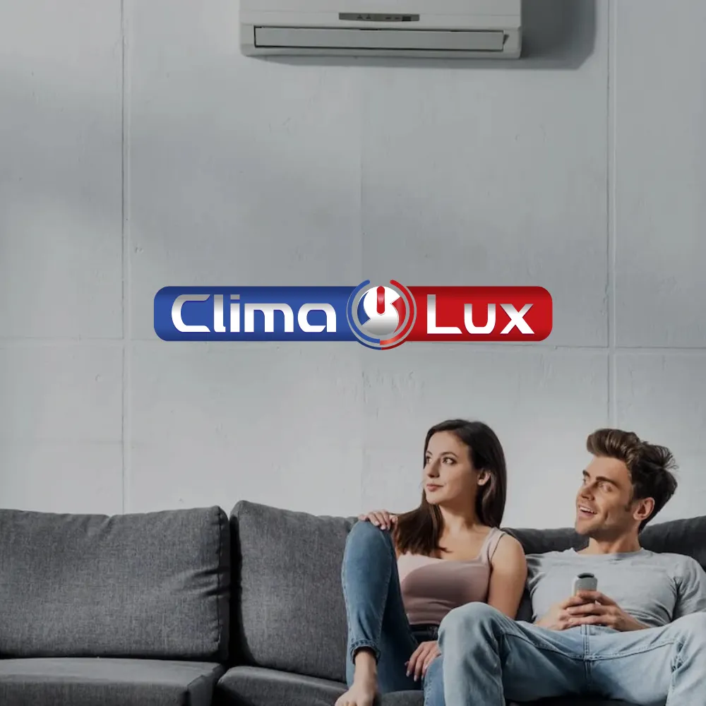
Clima Lux
Clima Lux Varna sells, installs and services air conditioners from leading brands, and we built their online store with a clear goal — to generate a steady flow of new inquiries.
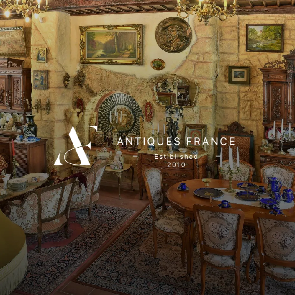
Antiques France
Antiques France is a virtual gallery of authentic antiques inspired by the Baroque, Gothic, Rococo, Breton and Empire styles, and we built its online store.