Green Shield Shop
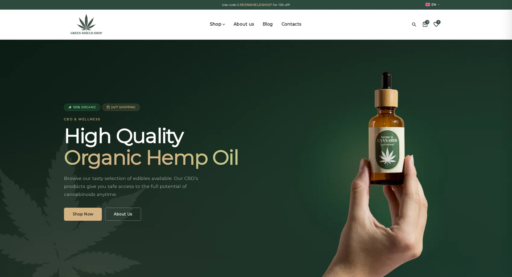
We built the multilingual online store Green Shield Shop — a European retailer of organic CBD products that sells in six languages.
Green Shield Shop
We built the multilingual online store Green Shield Shop — a European retailer of organic CBD products that sells in six languages. The catalog is organized both by product type — oils, capsules, cosmetics, dietary supplements and sweets — and by active ingredient percentage, because that is exactly the criterion customers choose by. Age verification and a clear explanation of the legal framework around CBD sit at the start of the journey, keeping the store compliant with the requirements of each market. The result is a platform that serves customers in several countries from a single admin panel, without a separate website for each language.
- Custom design
- UX/UI
- Web design
- Web development
- Back-end development
- Optimization
- Front-end development
- Hosting & maintenance
- Online stores
Branding
The mark is a leaf drawn in fine lines like a botanical illustration, and below it the name is set in a serif with wide letter spacing. The tone is apothecary, not street culture: dark green, cream and champagne, which keep the product close to cosmetics and supplements.

Colors
Cream
HEX #F6F4F0
RGB 246,244,240
Sand
HEX #E4E0D8
RGB 228,224,216
Champagne
HEX #D4B483
RGB 212,180,131
Green
HEX #2C4A3E
RGB 44,74,62
Dark green
HEX #162820
RGB 22,40,32
Typography:
Montserrat
Aa, Bb, Cc, Dd, Ee, Ff, Gg, Hh, Ii, Jj, Kk, Ll, Mm, Nn, Oo, Pp, Qq, Rr, Ss, Tt, Uu, Vv, Ww, Xx, Yy, Zz
0 1 2 3 4 5 6 7 8 9 10


Design for every
device
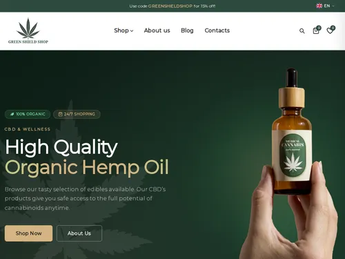
We design for each screen size separately — from a widescreen monitor to the phone in your pocket — so the experience is equally good everywhere.
Over 22 pages
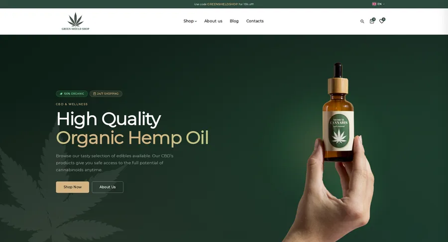
A clear structure and well-organized content in which visitors find what they're looking for on the first try.
Design for desktop and mobile
One design that looks and works equally well on a monitor, tablet and phone.
Easy to use
Intuitive navigation and fast loading — nothing standing between the customer and the action.
Every view is tested on real devices before launch — because mobile traffic has long been the main traffic, not the extra.
Built with the mobile screen in mind
Over 70% of visits come from a phone. That's why we start there — and build up to tablet and desktop, instead of shrinking a finished desktop design.
Every screen is checked on a real device, not just in a browser. That way, differences are caught before launch, not after it.

Scroll the screen in the phone — this is the project's real mobile version, exactly as the client sees it.
Phone first, then everything else
We design from the smallest screen up. That way, what matters most stays visible everywhere, instead of being hastily rearranged for mobile.
Fast, even on a weak connection
We optimize images and code for mobile networks. The page starts loading in under a second — not after the visitor has already given up.
Thumb-friendly
Buttons, forms and navigation are designed for one-handed use on the go — no zooming, no accidental taps.
Project timeline
The work proceeds in clear phases with a fixed scope — you know what happens in each one and when to expect the result.
Phase 1 1 week
ResearchStructureCompetitor analysisPhase 2 2 weeks
Custom designUX/UIWeb designPhase 3 2 weeks
Web developmentBack-end developmentFront-end developmentPhase 4 1 week
OptimizationHosting & maintenanceMore projects
All projects
Clima Lux
Clima Lux Varna sells, installs and services air conditioners from leading brands, and we built their online store with a clear goal — to generate a steady flow of new inquiries.
Antiques France
Antiques France is a virtual gallery of authentic antiques inspired by the Baroque, Gothic, Rococo, Breton and Empire styles, and we built its online store.