BulgarAuto
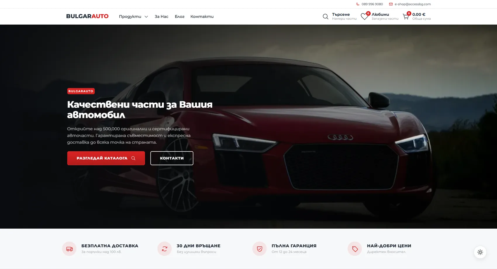
We built the BulgarAuto online store — over 500,000 genuine and certified auto parts with guaranteed compatibility.
BulgarAuto
We built the BulgarAuto online store — over 500,000 original and certified auto parts with guaranteed compatibility. With a catalog this size, what matters most is getting the customer to the part for their own car, so the structure follows systems and categories — lighting, interior, exterior, upholstery, consumables — with an item count on each, so it’s clear where there is plenty to choose from. The terms that remove hesitation when buying a part online sit right after the catalog: free delivery over a certain amount, thirty days for returns and a 12 to 24-month warranty. The store is built to take on new categories without restructuring.
- Custom design
- UX/UI
- Web design
- Web development
- Back-end development
- Optimization
- Front-end development
- Hosting & maintenance
- Cars & transfers
Branding
The brand is just a name split into two weights — “BULGAR” in black and “AUTO” in red, with no symbol. Red carries the buttons and discount labels, steel gray holds the text, and plenty of white is left between them so the product photos of the parts stand out.
Colors
White
HEX #FFFFFF
RGB 255,255,255
Misty gray
HEX #F6F7F9
RGB 246,247,249
Red
HEX #C82222
RGB 200,34,34
Steel
HEX #303A46
RGB 48,58,70
Typography:
Montserrat
Aa, Bb, Cc, Dd, Ee, Ff, Gg, Hh, Ii, Jj, Kk, Ll, Mm, Nn, Oo, Pp, Qq, Rr, Ss, Tt, Uu, Vv, Ww, Xx, Yy, Zz
0 1 2 3 4 5 6 7 8 9 10

Design for every
device
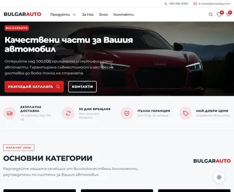
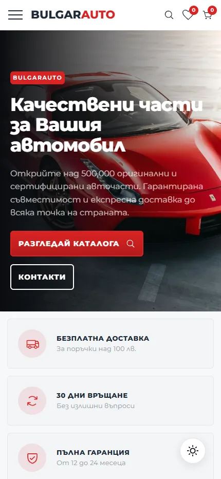
We design for each screen size separately — from a widescreen monitor to the phone in your pocket — so the experience is equally good everywhere.
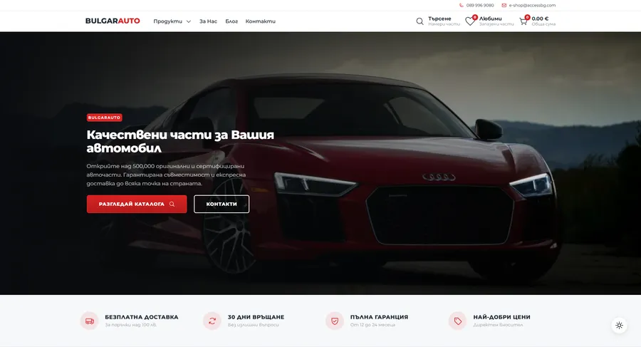
Over 22 pages
A clear structure and well-organized content in which visitors find what they're looking for on the first try.
Design for desktop and mobile
One design that looks and works equally well on a monitor, tablet and phone.
Easy to use
Intuitive navigation and fast loading — nothing standing between the customer and the action.
Every view is tested on real devices before launch — because mobile traffic has long been the main traffic, not the extra.
Built with the mobile screen in mind
Over 70% of visits come from a phone. That's why we start there — and build up to tablet and desktop, instead of shrinking a finished desktop design.
Every screen is checked on a real device, not just in a browser. That way, differences are caught before launch, not after it.

Scroll the screen in the phone — this is the project's real mobile version, exactly as the client sees it.
Phone first, then everything else
We design from the smallest screen up. That way, what matters most stays visible everywhere, instead of being hastily rearranged for mobile.
Fast, even on a weak connection
We optimize images and code for mobile networks. The page starts loading in under a second — not after the visitor has already given up.
Thumb-friendly
Buttons, forms and navigation are designed for one-handed use on the go — no zooming, no accidental taps.
Project timeline
The work proceeds in clear phases with a fixed scope — you know what happens in each one and when to expect the result.
Phase 1 1 week
ResearchStructureCompetitor analysisPhase 2 2 weeks
Custom designUX/UIWeb designPhase 3 2 weeks
Web developmentBack-end developmentFront-end developmentPhase 4 1 week
OptimizationHosting & maintenanceMore projects
All projects
Doctor Color
Doctor Color is a car service center in Varna that we've partnered with for over 10 years — continuous development, technical improvements and SEO optimization.
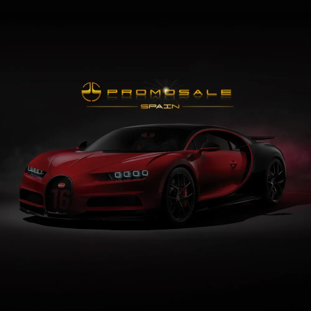
Promosale
We designed the elegant website of Promosale — a specialist dealer of luxury, sports and high-end cars, including German premium brands.