Boatify Halkidiki
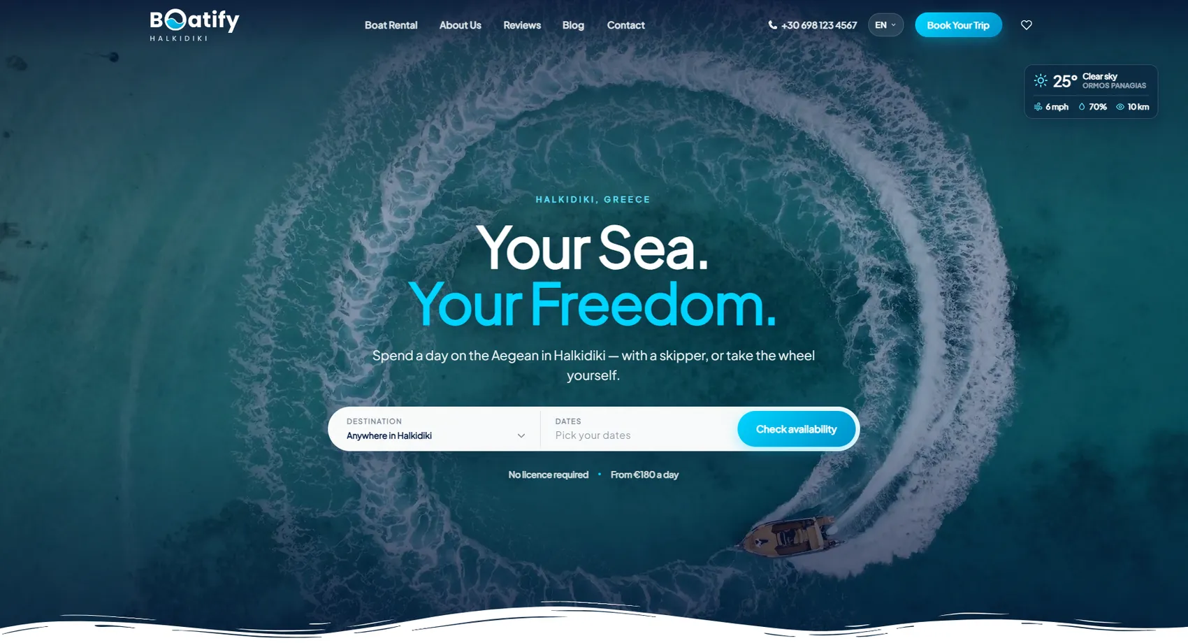
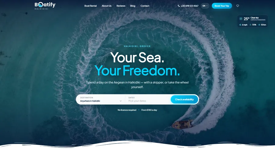
We developed the platform of Boatify Halkidiki — boat rentals along the Greek coast, with or without a skipper, bookable by destination and date.
Boatify Halkidiki
We developed the Boatify Halkidiki platform — boat rentals along the Greek coast, with or without a skipper, bookable by destination and date. The search starts on the home screen with the two questions every tourist asks: where they want to go and when they are free. From there, the choice is between a private cruise with a skipper and a self-drive boat that requires no license — the two options are shown side by side, with included services and a starting price, instead of being explained in a long text. The fleet is shown with capacity, type and price per day, and the website speaks the five languages Halkidiki's guests come from.
- Custom design
- UX/UI
- Web design
- Web development
- Back-end development
- Optimization
- Front-end development
- Hosting & maintenance
- Travel agencies
Branding
In the middle of the name, a wave stands in place of a letter — the mark is hidden in the word and reads from a distance. The cyan comes from the color of the water in Halkidiki and is reserved for buttons and accents, while the deep turquoise holds the text over the aerial photos.

Colors
White
HEX #F9FAFA
RGB 249,250,250
Cyan
HEX #01CDF6
RGB 1,205,246
Sea blue
HEX #0F758C
RGB 15,117,140
Deep turquoise
HEX #154956
RGB 21,73,86
Typography:
Plus Jakarta Sans
Aa, Bb, Cc, Dd, Ee, Ff, Gg, Hh, Ii, Jj, Kk, Ll, Mm, Nn, Oo, Pp, Qq, Rr, Ss, Tt, Uu, Vv, Ww, Xx, Yy, Zz
0 1 2 3 4 5 6 7 8 9 10

Design for every
device
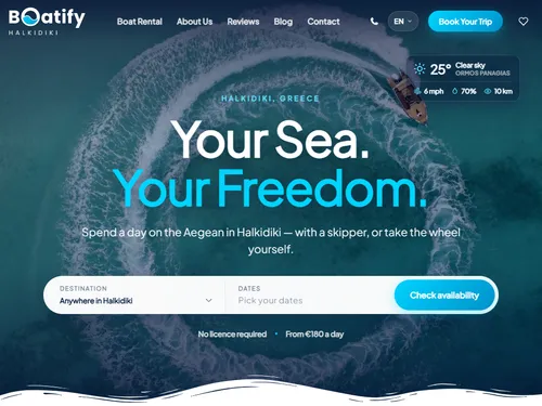
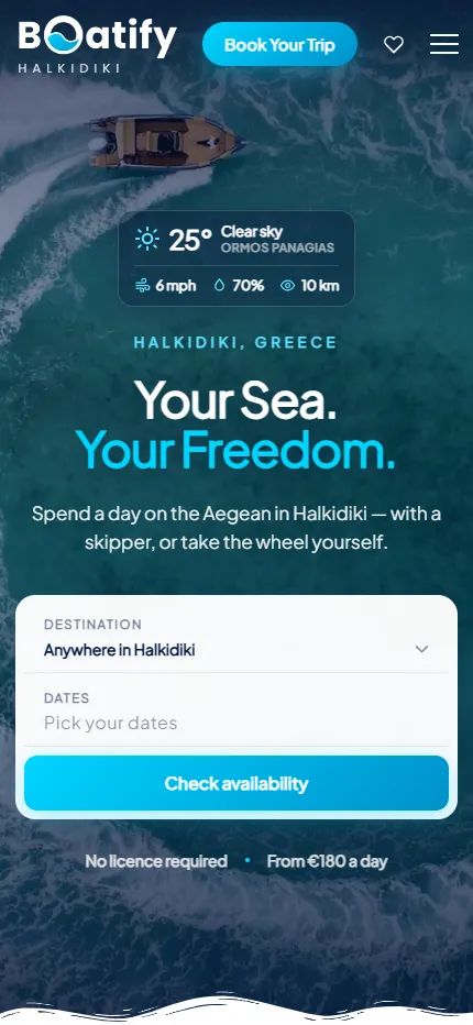
We design for each screen size separately — from a widescreen monitor to the phone in your pocket — so the experience is equally good everywhere.
Over 22 pages
A clear structure and well-organized content in which visitors find what they're looking for on the first try.
Design for desktop and mobile
One design that looks and works equally well on a monitor, tablet and phone.
Easy to use
Intuitive navigation and fast loading — nothing standing between the customer and the action.
Every view is tested on real devices before launch — because mobile traffic has long been the main traffic, not the extra.
Built with the mobile screen in mind
Over 70% of visits come from a phone. That's why we start there — and build up to tablet and desktop, instead of shrinking a finished desktop design.
Every screen is checked on a real device, not just in a browser. That way, differences are caught before launch, not after it.

Scroll the screen in the phone — this is the project's real mobile version, exactly as the client sees it.
Phone first, then everything else
We design from the smallest screen up. That way, what matters most stays visible everywhere, instead of being hastily rearranged for mobile.
Fast, even on a weak connection
We optimize images and code for mobile networks. The page starts loading in under a second — not after the visitor has already given up.
Thumb-friendly
Buttons, forms and navigation are designed for one-handed use on the go — no zooming, no accidental taps.
Project timeline
The work proceeds in clear phases with a fixed scope — you know what happens in each one and when to expect the result.
Phase 1 1 week
ResearchStructureCompetitor analysisPhase 2 2 weeks
Custom designUX/UIWeb designPhase 3 2 weeks
Web developmentBack-end developmentFront-end developmentPhase 4 1 week
OptimizationHosting & maintenanceMore projects
All projects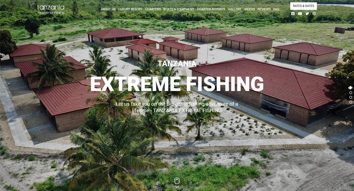
Tanzania Extreme Fishing
We created a captivating website for Tanzania Extreme Fishing — a fishing charter company 89 kilometers from Dar es Salaam, Tanzania.
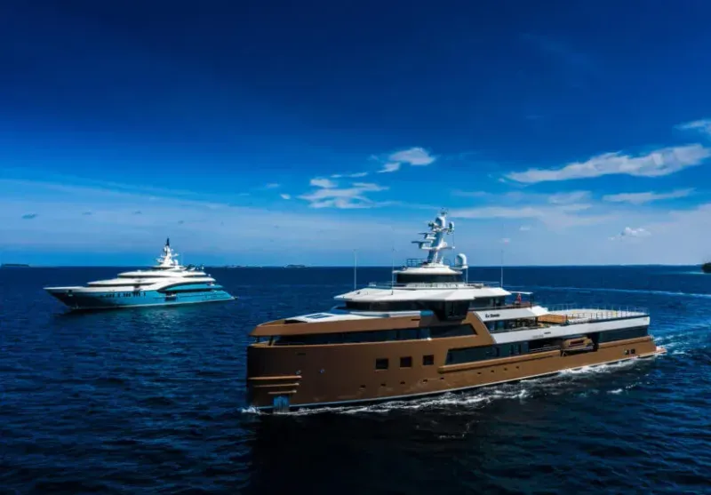
Nova Yachts
We developed the refined online presence of Nova Yachts — a superyacht management, charter and new-build company.