Antiques France
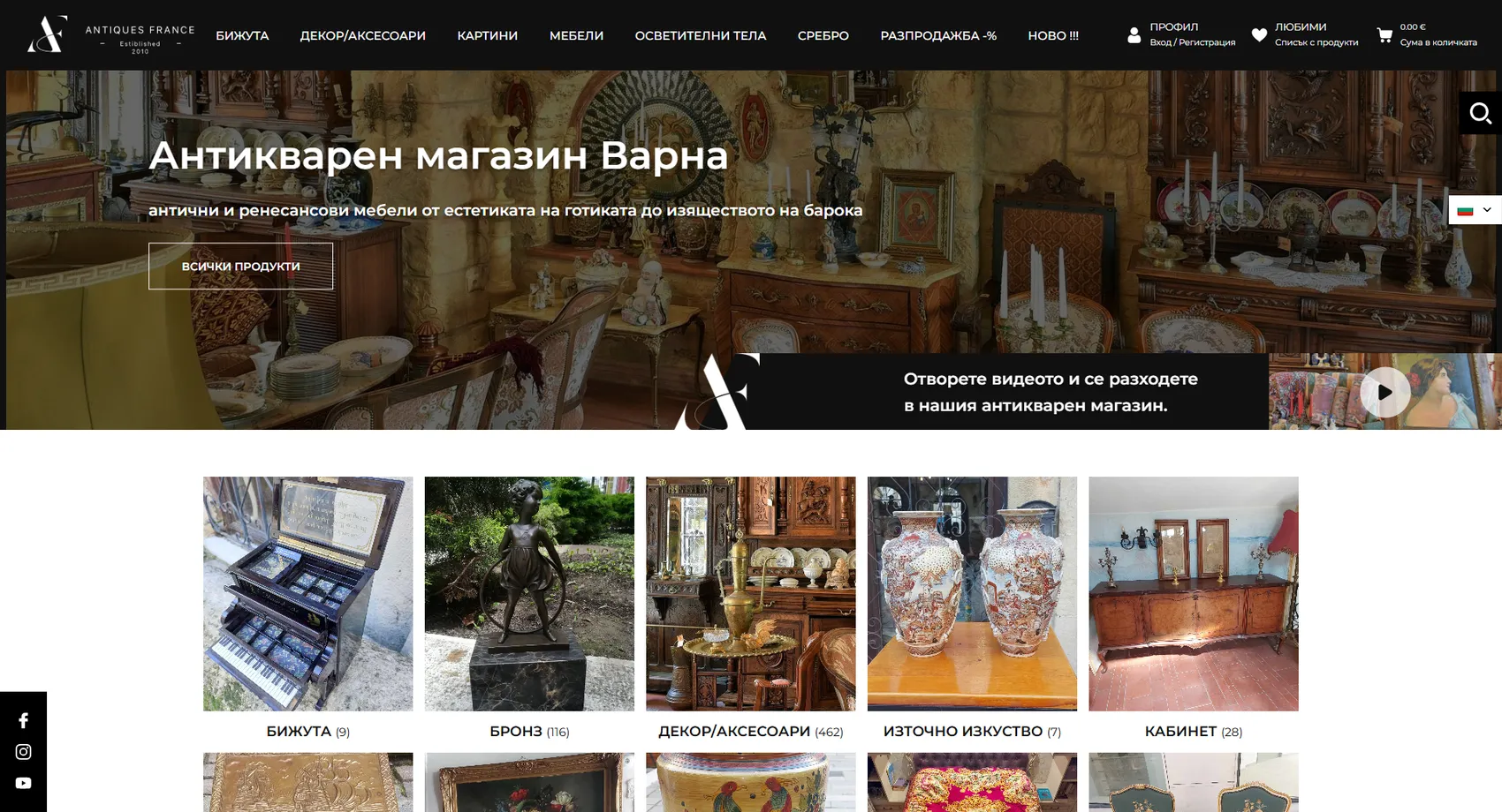
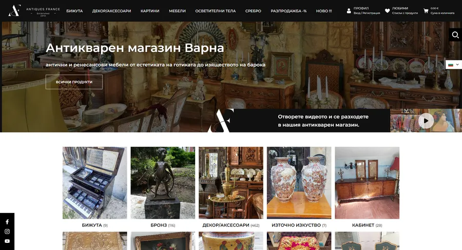
Antiques France is a virtual gallery of authentic antiques inspired by the Baroque, Gothic, Rococo, Breton and Empire styles, and we built its online store.
Antiques France
Antiques France is a virtual gallery of authentic antiques inspired by the Baroque, Gothic, Rococo, Breton and Empire styles, and we built an online store that carries this aesthetic online. The elegant design and detailed descriptions of each item's provenance build trust with collectors for whom authenticity is decisive. Secure, easy shopping makes buying a valuable antique a calm process rather than a risky one. We created a digital showroom that attracts connoisseurs from across Europe, not random visitors.
- Custom design
- UX/UI
- Web design
- Web development
- Back-end development
- Optimization
- Front-end development
- Hosting & maintenance
- Online stores
Branding
The brand is deliberately almost colorless — the objects themselves are the showcase. The logo is white, typographic and sits on deep black so it doesn't compete with the patina of the furniture and porcelain. Gold appears only in small touches, where value needs to be felt.

Colors
Deep black
HEX #101010
RGB 16,16,16
Patinated gold
HEX #DDB162
RGB 221,177,98
Ice blue
HEX #5CC8FF
RGB 92,200,255
Light gray
HEX #EFEFEF
RGB 239,239,239
Typography:
Montserrat
Aa, Bb, Cc, Dd, Ee, Ff, Gg, Hh, Ii, Jj, Kk, Ll, Mm, Nn, Oo, Pp, Qq, Rr, Ss, Tt, Uu, Vv, Ww, Xx, Yy, Zz
0 1 2 3 4 5 6 7 8 9 10

Design for every
device
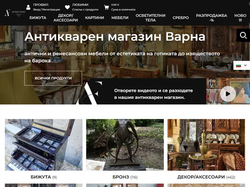
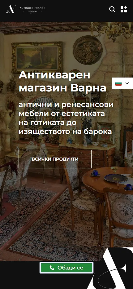
We design for each screen size separately — from a widescreen monitor to the phone in your pocket — so the experience is equally good everywhere.
Over 22 pages
A clear structure and well-organized content in which visitors find what they're looking for on the first try.
Design for desktop and mobile
One design that looks and works equally well on a monitor, tablet and phone.
Easy to use
Intuitive navigation and fast loading — nothing standing between the customer and the action.
Every view is tested on real devices before launch — because mobile traffic has long been the main traffic, not the extra.
Built with the mobile screen in mind
Over 70% of visits come from a phone. That's why we start there — and build up to tablet and desktop, instead of shrinking a finished desktop design.
Every screen is checked on a real device, not just in a browser. That way, differences are caught before launch, not after it.

Scroll the screen in the phone — this is the project's real mobile version, exactly as the client sees it.
Phone first, then everything else
We design from the smallest screen up. That way, what matters most stays visible everywhere, instead of being hastily rearranged for mobile.
Fast, even on a weak connection
We optimize images and code for mobile networks. The page starts loading in under a second — not after the visitor has already given up.
Thumb-friendly
Buttons, forms and navigation are designed for one-handed use on the go — no zooming, no accidental taps.
Project timeline
The work proceeds in clear phases with a fixed scope — you know what happens in each one and when to expect the result.
Phase 1 1 week
ResearchStructureCompetitor analysisPhase 2 2 weeks
Custom designUX/UIWeb designPhase 3 2 weeks
Web developmentBack-end developmentFront-end developmentPhase 4 1 week
OptimizationHosting & maintenanceMore projects
All projects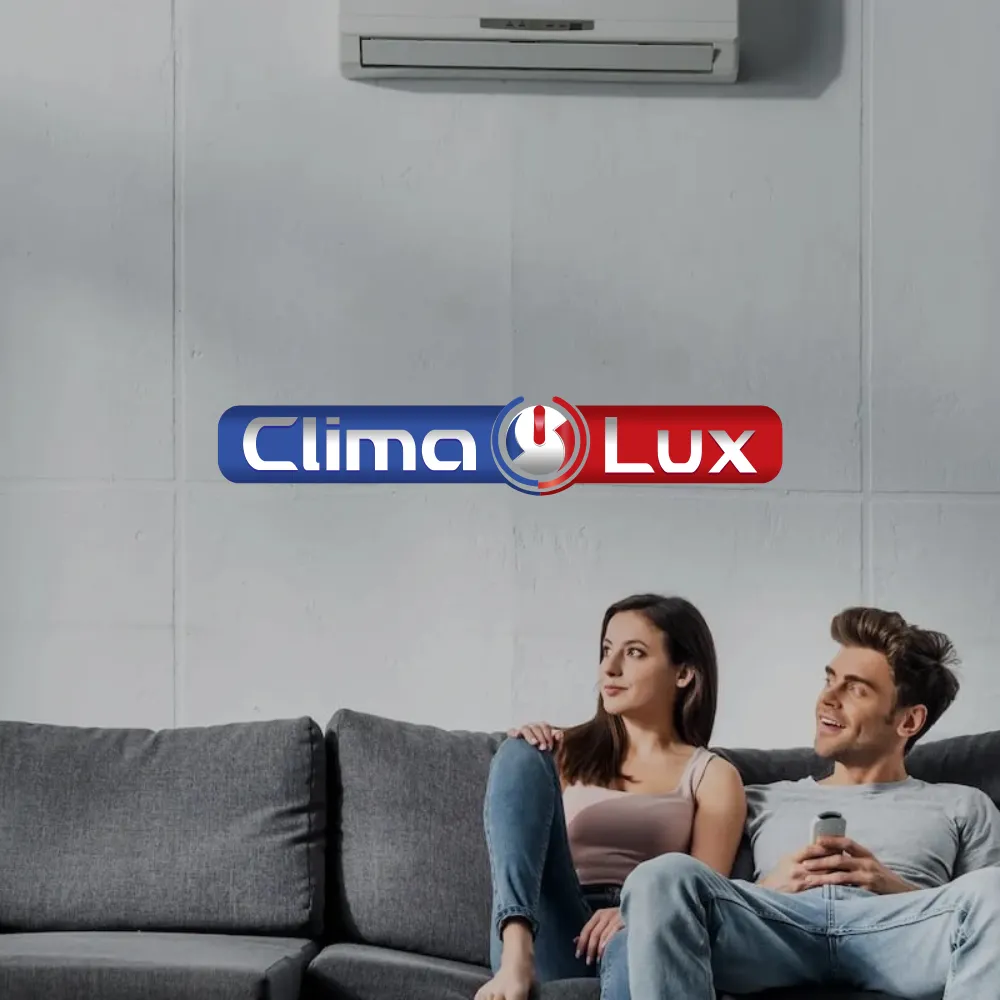
Clima Lux
Clima Lux Varna sells, installs and services air conditioners from leading brands, and we built their online store with a clear goal — to generate a steady flow of new inquiries.
Ave Ceramica
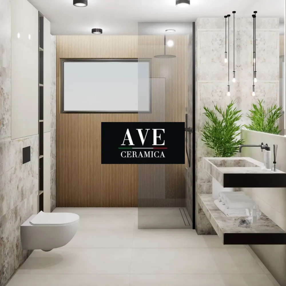
We designed an inspiring website for Ave Ceramica — a company founded in 2016, with showrooms in Varna and Sofia, presenting 3D projects and porcelain stoneware.